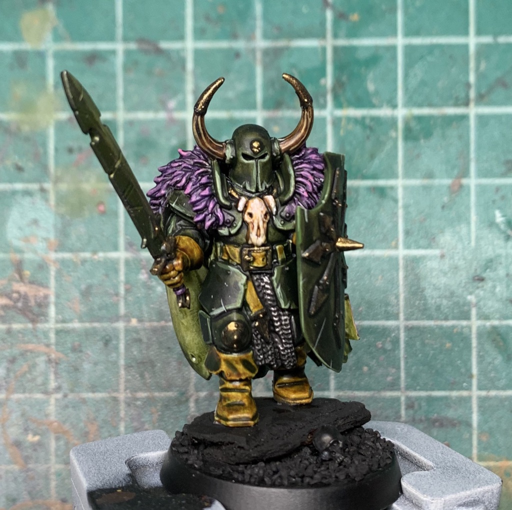
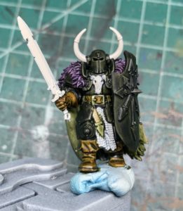
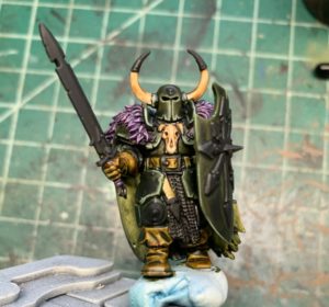
So if you’re here just for recipes feel free to skip on ahead, I just wanted to do a quick intro about why & how this all came about in case anyone’s interested in the process of coming up with the color scheme. My parameters for this were that it needed to be fairly simple to execute & replicate, colors were black-ish, gold trim, and purple cloak. I decided to go with contrast paints because it’s a good way to get a lot of saturated color going without getting into too much blending or layering. This does have some edge highlighting and such but what I like about it is that the colors really carry the scheme so the painter can do as much or as little edge highlighting & battle damage as they are comfortable with. More advanced painters can take it from this starting point and do more weathering on the leathers, etc.
As far as the color choices go: I like layering contrast paints, particularly black and grey to add some interest to otherwise dull colors. I pair black with blue a lot but in this case I didn’t think it would go as well with the purple cloak. Green and purple are always a nice color combination so I thought I’d go with that. From there I decided to have the leathers still be brown, but experiment with tinting them with the green because I thought it would tie everything together to be a bit more thematic – warmer browns would have felt a bit out of place. They would’ve gone ok with the purple but then the purple and the brown would’ve pulled interest from the armor and the armor really needs to be the focus of the model in my opinion. The sword was a bit of a last minute decision and again I really just like the overwhelming green tint to the model and I also just really enjoy tinting metallics with contrast paints.
Now for the how to portion!
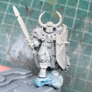
Because I was working with this guy pre-assembled I brush primed all the ‘interior’ areas black – spots that are going to be dark anyway like up under his cloak, under his shield arm etc. You can try spray priming but trying to stick a rattle can up in there is not my idea of a good time. I then spray primed with Wraithbone. If you want to try spray priming Wraithbone first then sticking a paintbrush with dark paint on it into the darker areas it’s certainly an option but then you run the risk of having to hit it again with the white anyway if you accidentally get black where you don’t want it. You can also try doing more of a zenithal priming approach, some people like it for contrast and think it’s great. I have yet to get good results from zenithal priming + contrast paints because there’s such a sharp drop off in saturation when you’re not using them on a lighter colored base.
Now for the contrast paints – and order of operation is important in my opinion – I like going dark to light because if you accidentally get a bit messy with your paint it’s a lot easier to fix a light color on a dark color (might not even really be an issue depending on the color) than it is having to go back and try and fix a dark stray brushmark on a lighter color. Also with contrasts I know it’s supposed to be one thick coat or whatever but I prefer a somewhat lighter touch – I throw enough paint on that it flows easily over the surface of the model but then wick up any pooling with my brush. Too much contrast paint can end up drying gummy and while there’s going to be pooling, it’s best to at least try to minimize it. If you need more saturation it’s easier to add another layer than it is to try and fix what happens when you dump half the bottle on the model. That being said if you’re worried about not having enough working time – the paint is drying before you’ve finished covering an area – just use some of the contrast medium.
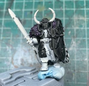
For this guy, I started off with painting the cloak with Shyish Purple. This is the color in particular it’s really easy to go overboard with as it can end up being way too dark. As soon as the edges start to dry you can start with your black, and that goes on the armor plate, the helmet, and the shield. Again, try not to be too heavy handed with it since it needs to be light enough to tint. This is also where order of operations starts to come into play – you could put down the green first then the black but if the black ends up being too dark then you’ve wrecked two layers of paint instead of just the one.
So you can see there’s stray bits of black on the cloak, I stipple on a light layer of wraithbone (put paint on brush, use the side of the brush and just tap gently over the area) to cover it up. It’ll take several layers to completely cover it but I’ve found just a couple layers is all you really need to lighten it up as to not be noticeable.
Now for the next contrast color, Militarum Green. I picked this one because it’s got a fair amount of yellow in it, which plays off the purple nicely. A green with more blue in it would blend in more with the purple instead of contrasting with it. You can see here that I used it on the armor & the leather bits. I also ended up using it on the underside of the cloak so you can do that as well during this step.
Next step is to layer Snakebite Leather on all the leather bits. The green should come through a bit, not a lot, but there’ll definitely be a tint. At this stage you can also throw some Skeleton Horde on all the bone bits.
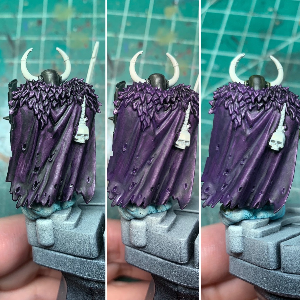
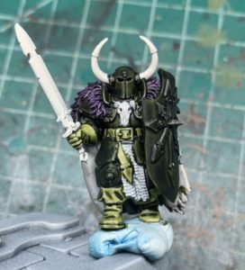
Circling back around to the cloak, you can see on the leftmost image that the Shyish Purple is pretty blotchy, also a bit too dark in spots. To fix this, you just need to do a couple thin layers of Xereus Purple. The second and third images are after one and two coats, respectively. Because Xereus is close to your midtone, it essentially averages out the layer of Shyish Purple – it brings up the parts that are too dark and further shades the parts that are a bit too light. The thing I like about this method is, just to get decent coverage with a purple you’re going to be doing a couple coats anyway, then you’ll need to do your shadows and your highlights and then some blending. That’s a lot of layers. This is three. Granted it’s not going to compare to something that is painted at a competition level, but this is pretty solid for tabletop as there’s still a bit of shading and it’s all relatively smooth.
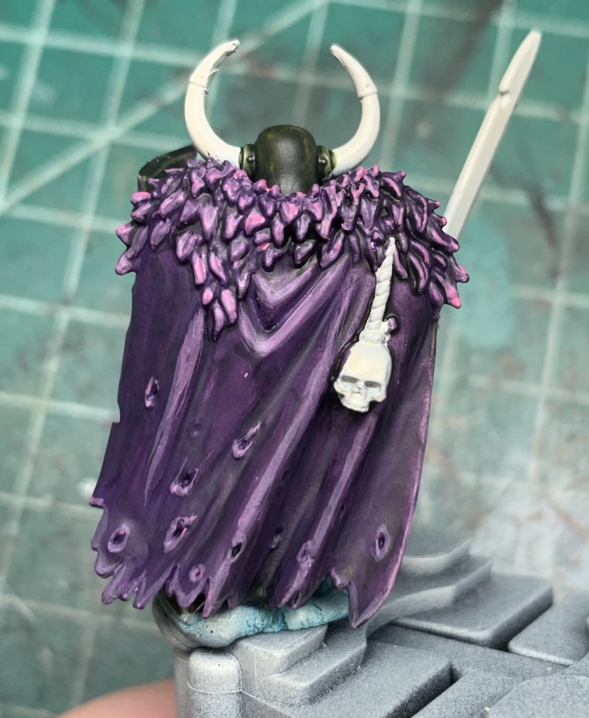
Speaking of tabletop level, I kept this next step pretty painterly, as I wanted something that didn’t require a lot of blending. All the pink is Emperor’s Children, applied with the side of the brush on the fur so you’re just catching the edges, and you can do the same thing with the ridges on the cloak and the outermost edges.
At this point you can pretty much be done with the cloak or you can add some random wear and tear, again all Emperor’s Children applied thinly with a pointy brush.
At this point I painted everything I wanted to be metallic in black. You can really do this step just about any time, and if you are worried about your ability to paint cleanly then I would definitely do it right after priming. Some people prefer to paint black under silver and deep brown under gold but black is simple and it works so that’s what I use. Metallics by themselves aren’t good for crisply defining an area so using a dark base color really helps with that and it also helps your metals cover better, faster. Here I’ve also done the edge highlights which are more impressionistic than exact and while they aren’t strictly necessary I would say at least try to do a bit on the helmet, the collar edges and the shield. The first, broadest highlight is a blend of Castellan Green and Moot Green, roughly 50/50. On top of that I did the same mix with just a touch of white for the thinner edge highlights.
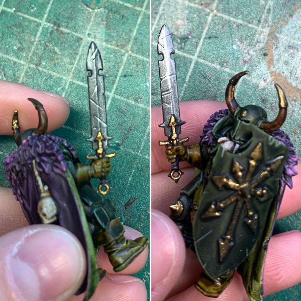
Next step is all the metallics, I like Vallejo Model Color but really all you need to do is paint all the metallic bits gold except for the sword and the chainmail. With the sword I took my darkest silver metallic and my lightest silver metallic and worked out some very basic shading – the uppermost half being the brightest and the lower half the darkest, then used the same colors for the scratches. With the chainmail I just painted it my brightest silver then did a couple washes of black. The last step for the sword was using Plaguebearer Flesh contrast paint to tint it. You can use Militarum Green if that’s what you’ve got but you won’t get that same brightness out of it. If you don’t want to tint it green, I can also strongly recommend Gryph-Charger Grey, it’s a lovely steely blue gray that looks fantastic in TMM and NMM applications.
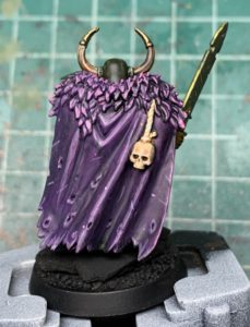
Now the horns are not what I would consider easy since they’ve got the stripes on them, but even if you don’t do the stripes you could just dry brush your brightest color on top. I had started with Skeleton Horde but decided I wanted to start with a darker base color so I ended up using Wyldwood Contrast. The stripes I did with Ushabti Bone, and then to soften the harsh edges of the lines I did a thin layer of Skeleton Horde on top. If you are dry brushing your highlights I would still recommend topping it off with the Skeleton Horde because it just blends everything together really nicely and then you can do a spot highlight or two after if you want. The goal being mostly to avoid lots of blending & layering and letting the contrast paints do all the heavy lifting for you.
After that all that’s really left is some quick dry brushing and/or highlighting on the bone parts with some Screaming Skull. If I was going to push this farther I would probably do some scratches and scuffs on the leather parts, not sure what color but if I had to guess I’d say Balor Brown with a bit of Militarum Green thrown in to tint it just a little. Or just glaze it with Balor Brown to even out the darkest patches, then work on the scratches. And that’s the nice thing about this scheme, there’s lots of room to push it further but you don’t have to.
And that’s it! If you have any questions feel free to leave a comment or email me 🙂
0 thoughts on “Slaves to Darkness: Quick & Easy With Contrast Paints”