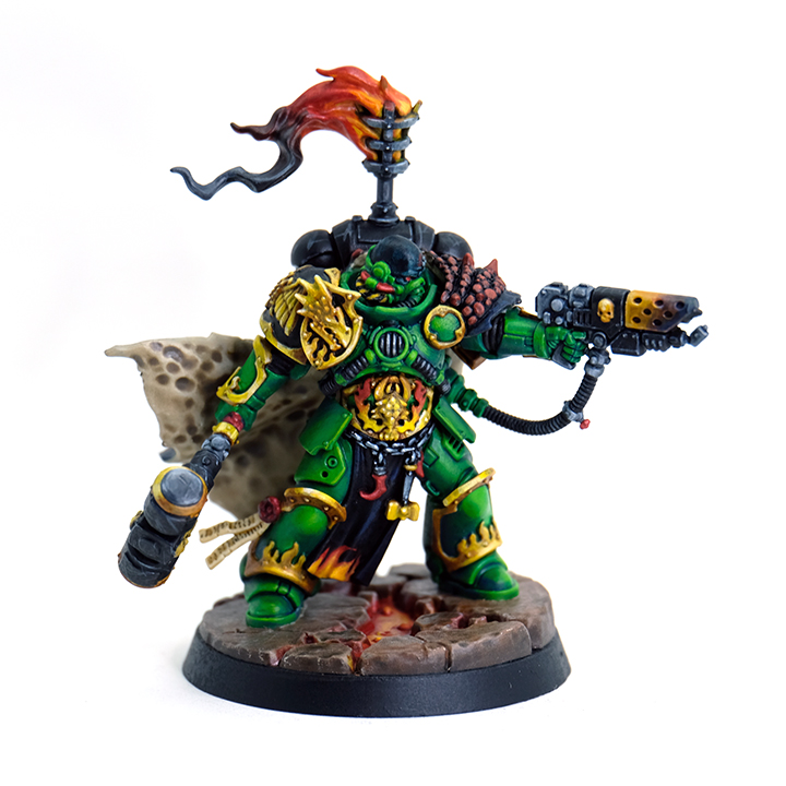
So I picked this guy up because I wanted to practice painting some marines. Dunno how other marine HQ sculpts measure up but this one was genuinely enjoyable to paint, was able to do sub assemblies with minimal issues and all the details are nice and crisp. I wanted to stick pretty close to the box art since I don’t really know enough about Salamanders to start improvising, but I did make a very deliberate decision to up the saturation. And this model was also a good chance to work on some NMM practice.
My current approach to painting is to block in ‘placeholder’ colors with contrast paints. I don’t do it for everything but if it’s a large area or a color that’s going to be tricky to get good coverage with, I usually start with contrast paints. They get really good coverage in one coat, and are good for blocking out the high and low points of the sculpt so you can work out lighting.
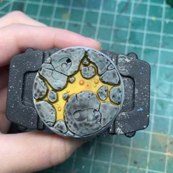
The base I don’t have a complete process documented for mostly because I just kind of threw contrast paints on one after the other until I got a color I liked, I was originally going to go with a blue grey color and ended up with something much warmer. The lava though, is mostly washes and contrast paints. I started with Iyanden Yellow, then filled up the recessed area with water and dropped some Blood Angels red into it. This causes the contrast paint to flood out to the edges. I could have used contrast medium but for this particular application I find that it desaturates the color a bit, and I wanted to keep the saturation on the edges and have it lighter in the middle, all in one coat. And since it stains when it goes on, by putting the water down first that keeps it from staining super hard in the middle.
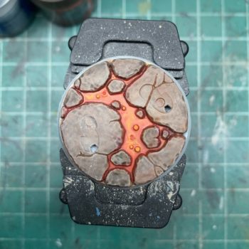
At this point I took some Flash Gitz Yellow and a very pointy brush and just did some wavy yellow bits to make the lava look all swirly and that’s pretty much it. The other nice thing about using contrast paints to do the lava is that they naturally wanted to creep up the sides which worked out well to make the lava look a bit glowy with minimal effort on my part.
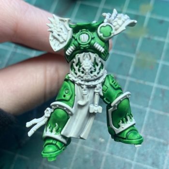
So with the model itself I decided to start with just the body since I knew the cape was going to get in the way. The seam on the cape is slightly inconvenient but doesn’t show too badly, same goes for where the seam hits on the sides, most of that is covered up just fine. Arms I almost always leave off by default since they are the easiest part of the model to adjust if I have assembly issues. I did just one coat of Warpstone Lightning to block in the green. I didn’t worry too much about it being messy since I knew I was going to do NMM and my base colors for that cover decently enough in a coat or two to cover any stray paint.
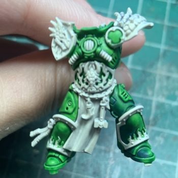
The next step is to start blocking in shadows with Kantor Blue. I didn’t blend super hard at this stage since there’s still midtones and highlights to go, but I did feather the edges a bit so I wouldn’t hate myself later. I chose Kantor Blue over a darker green or black because it gives you a much more saturated look. At this point you can use the darker areas made by the contrast paints as a good starting point for where to put the shadows. You can see the difference between just the contrast paint (left side) and the contrast paint + the blue (right side).
I used Warpstone Glow as my midtone, and moot green as highlights. It’s still pretty rough in the above picture but you can see how it all takes shape over the framework of the contrast paint. I didn’t really start tightening up the colors and the blends until the model was more assembled – the cape and the arms were going to affect my lighting.
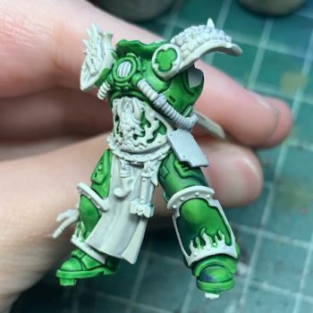
So here it is all coming together, I kept my layers pretty thin and it all melts pretty nicely into the contrast paint. Also getting into some of the NMM at this point, I’m really leery of writing a guide because it’s something I’m still figuring out and there’s already so many guides. But for people wondering about colors, I used Balor Brown as a base, then a layer of Snakebite Leather, then Ushabti Bone and a bit of white to sketch out values, then hit it with a wash of Casanadora Yellow to tint it all more yellow. This gets me pretty close to something resembling metallics, then it’s just a lot of tweaking with various mixes of Balor Brown, Mournfang Brown, Flash Gitz Yellow and a bit of white to smooth everything out and get the values right. On this particular model I wanted the gold/brass to be pretty yellow and bright so it’s got quite a bit more yellow than I normally do and I flattened out the range of values so the darker areas are at most more of a midtone than a shadow.
Fast forward, all the greens have been blocked in, and the side panels have been added and the model’s been affixed to the base. The side panels were a bit of a pain to do separate but I didn’t want to have to deal with painting around them and they’ve got tubes sticking out that also would’ve got in the way.
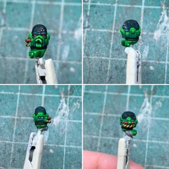
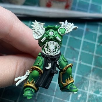
Next up, the head! Did the same thing with the green, started with contrast then built up the shading on top of that. The skintone was something I was a bit stumped by at first – I didn’t know Salamanders lore and was like why on earth did they pick that shade for his skin, it’s just flat and highlighted with grey and just looks super unnatural. Then I did some research, and this is what I ultimately landed on for my interpretation. I like using blue a lot to highlight black or even sub in for black – it’s visually much more interesting but functionally is nearly identical and this model already has a lot of blue in it so it’d tie in nicely to what I already had. It also really sets off the red in the eyes. To achieve this look I did one coat of Talassar Blue contrast paint then glazed over it with black.
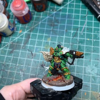
So at this point he’s got an arm and his cape as well as the head. I was going to put the cape on right after the head but it covers the bit where the tube coming down from his arm connects to the rest of the model so I had to do the arm, then the cape. I don’t have a lot of pictures of the back in progress because most of it’s covered by the cape – I did some very rudimentary shading so if you look at it under the cape it doesn’t look like complete garbage but it’s mostly just a mix of Kantor Blue and Warpstone Glow. I painted the underside of the cape before attaching it but not the top because I wasn’t sure if I’d have to use gap filler or not on the seam. (I ended up not having to use gap filler, just melted it together with plastic cement and it looked decent enough) The underside of the cloak is a mix of Steel Legion Drab and Stormvermin fur – this is one of the few colors I tried to match to the studio paint and this was my best guess. I did a very thin coat and because I used Wraithbone primer it kind of just shaded itself, and in one coat. I ended up touching up the edges at the very end with some Karak Stone and Screaming Skull but I’m still kind of baffled at how little work it took.
Now for the exterior of the cloak. I didn’t really have a plan so I figured I’d go along with the studio paint for the time being, and started by painting it black.
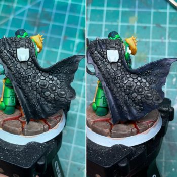
Didn’t really do much for me, so I took some Kantor Blue and glazed along the edges. Much better. It’s obviously very different from the blue of the head, which is a good thing in my opinion. I didn’t want it to be too matchy and they’re also not the same kind of skin, so different textures = light reflecting differently.
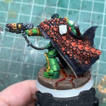
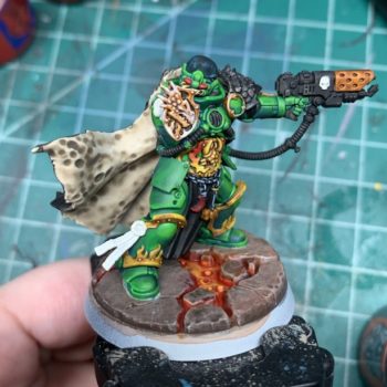
For the scales, I started with Mephiston Red, which has pretty decent coverage for a red, but was still pretty dark on top of the black, so I did a second coat that was a mix of Mephiston Red and Evil Sunz Scarlet. I almost kept the scales like this because I really liked the way the color played off the green and also brought out the blue in the cloak. I ended up doing a wash over it of Kantor Blue mixed with Black, and that tied all the colors in the cloak together.
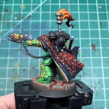
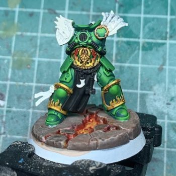
And he’s fully assembled in that picture because we are nearing the end of the post. The flames I didn’t document as well because I haven’t painted a lot of flames so I figured it’d be a lot of messing about and not so much a process. (I was right.) The rest just more NMM nonsense for the most part, the grey is literally just white and black mixed together in varying percentages, although I do like to tone it a bit with Gryph-Charger Grey contrast paint. The wrap on the hammer is basically the same recipe as the scales on the cloak.
And that’s it! If you have any questions feel free to ask them, I do check comments periodically but email’s the fastest way to get ahold of me.
0 thoughts on “Adrax Agatone”