Just to clarify: I used other paints in addition to contrast paints. In the context of coming up with this paint scheme I wanted to use contrast paints as a starting point, then work on refining them as efficiently as possible using coordinating regular paints.
This is meant to be more of a guide/color recipes than a how-to, as I just want to focus on using contrast paints in working up a quick paint scheme than get bogged down in specific techniques. I have a rough order of operations that, in my opinion, allows for a minimal amount of layering (the point after all is to tweak & refine the contrast layer, not paint completely over it) but beyond that I don’t want to get too specific because everyone’s got their own preferred method of blending.
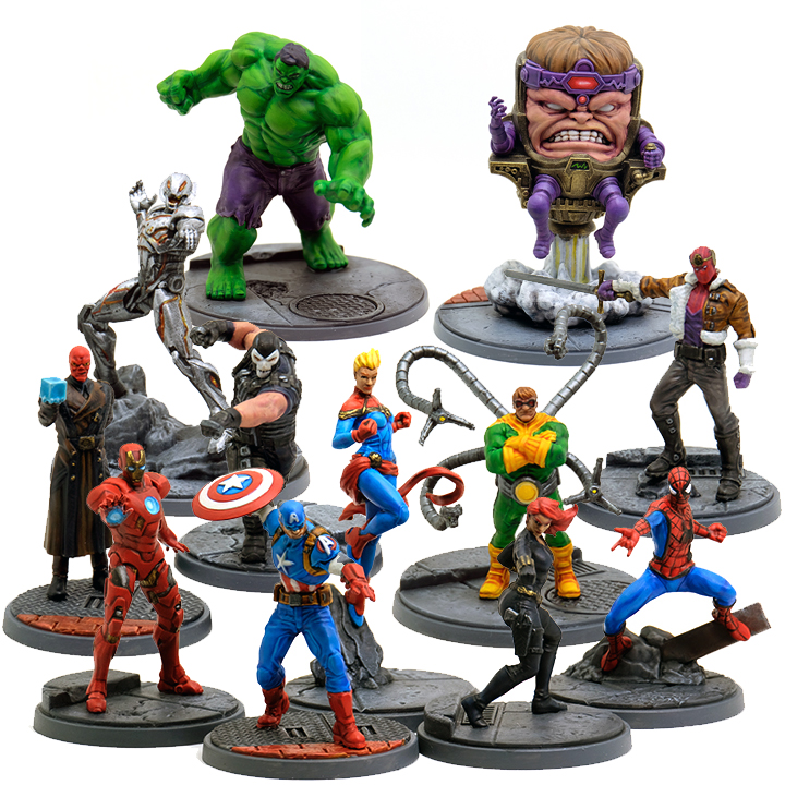
I started off by priming all of these models with Wraithbone, although as long as your primer is reasonably light colored I don’t think it will make that much of a difference. Sections that are going to be metallic I paint black first so they have nice crisp edges – the particles in metallic paints do not make for clean edges – and metallic paints just look better on top of a dark layer. The bases are all Mechanicus Standard Grey, washed with black then drybrushed with a lighter grey. Metallic parts like manhole covers were lightly dry brushed with Vallejo Gunmetal. The bricks are Mournfang Brown, glazed with Mephiston Red.
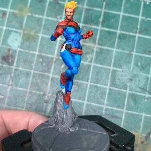
So here’s the beginnings of Captain Marvel. This is just contrast paints and black. I left off her sash because painting around it would’ve been a pain and the seam left by attaching it later isn’t too terrible. The colors I used are: Iyanden Yellow, Guilliman Flesh, Talassar Blue, and Mephiston Red. As you can see it’s not terrible with just contrast paints but they’re always going to be a bit patchy. So the next step is to glaze with your shade color. They’re colors that are close to the darker parts of each contrast paint and what glazing does is it’s going to even out some of the patchiness. You don’t want to be too heavy handed, but on the off chance you obliterate your shading, you can carefully layer on some of the contrast paint to get your shadows back. The colors for this stage are Caledor Sky and Mephiston Red. The face & the hair don’t get this step because they’re smaller and don’t need it.
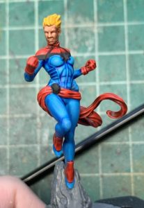
The next step is to work on highlights, not going to get too deep into technique here but the colors used are Temple Guard Blue and Evil Sunz Scarlet, with a tiny bit of Wild Rider Red. Because these colors are close to the contrast color your layers should be thin and will ‘melt’ right into the contrast paint – the point is to refine existing highlights.
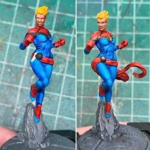
So as you can see it’s not a complete reworking and as long as you’re not too heavy handed it should only take a couple of passes over each color to tweak it. The face is refined with Cadian Fleshtone and Kislev Flesh, and the hair is just quickly highlighted with Flash Gitz yellow mixed with a bit of white.
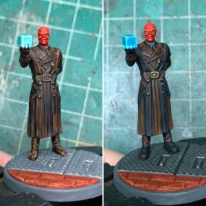
So from here on out now that I’ve detailed the general process this is just going to be quick highlights from remaining models with before/afters of contrast and contrast + regular paint. The brown leather is Wyldwood Contrast, the skin is Blood Angels Red. The black trim is just regular black paint. The coat is glazed with Naggaroth Night (gives more saturated shadows on leather than just using brown) and highlighted with Skrag Brown. The skin is glazed with Mephiston Red and highlighted with Evil Sunz Scarlet. The tesseract is just regular paints, Baharroth Blue, Caledor Sky, and white.
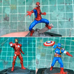
So these three are actually all the same recipes & methods as above since it’s the same red & blue. I did use Wraith Bone for the white parts, and the leather on Cap is Snakebite Leather. I usually don’t modify Snakebite Leather when I use it, especially on small areas like straps.
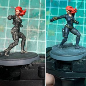
So Black Widow and Crossbones are actually very similar, to the point where I spaced out and didn’t take progress pictures of Crossbones. This is my favorite way to do ‘black’. It’s Black Templar with a glaze of Kantor Blue. There’s no real highlights because I like to keep the blue subtle but if there needs to be any further blending/smoothing you can just mix some black into Kantor blue and glaze away, and then use Kantor to gently highlight if you’ve knocked the brightness down too far. Some straps or sections of cloth can just be flat black with grey edge highlighting to break up the blue a little, this applies more to Crossbones since his armor is a bit more complex.
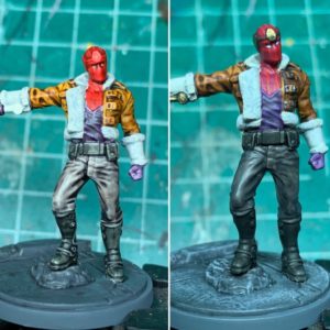
So this guy is Blood Angels Red, Snakebite Leather, Basilicanum Grey, Apothecary White, Black Templar, and Shyish Purple. The red is glazed & highlighted with Screamer Pink. The leather is glazed with Rhinox Hide. I chose not to highlight because there’s already a lot of textural things going on. The purple is glazed with Xereus Purple, highlighted with Genestealer Purple. The grey and the black are glazed with black, then the pants get an additional glaze of Stormvermin Fur. Any additional smoothing for the pants can be done with light layers of Stormvermin and black.
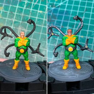
The yellow is Iyanden Yellow, and I only barely retouched it using Yriel Yellow and a bit of Flash Gitz. The green is Warpstone Lightning, glazed with Warpstone Glow, and highlighted with Moot Green. The hair is actually just a thin layer of Mournfang Brown.
The green is the same as on Doc Ock,and the purple is Shyish Purple, glazed with Naggaroth Night and highlighted with Xereus Purple. The hair is Black Templar glazed with Kantor Blue.
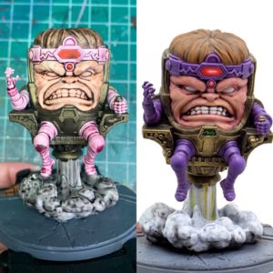
So I decided to go with Magos Purple instead of Shyish Purple contrast because I thought it would be easier to work it darker than work it lighter but if I did this model again I’d probably start with Shyish Purple. I highlighted & smoothed it out with a lot of layers of Xereus Purple. The red is the usual Blood Angels Red combo, worked to pure white for the highlights/glow. The hair is Wyldwood glazed with Mournfang Brown and highlighted with a mix of Mournfang and Balor brown. The skin is Guilliman Flesh, glazed with Screamer Pink then smoothed out with Cadian Fleshtone and a bit of Kislev Flesh for the brightest highlights.
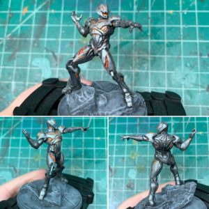
So Ultron uses no contrast paints, he’s just a lot of drybrushing metals over a black base, with thin layers of red and yellow for the glowy bits.
And that’s it for these guys, tried to keep it brief. I’ll start a separate blog page for good color combinations with contrast paints but I thought this would be a good demonstration of how you can make contrast paints look really good without a lot of extra effort.
0 thoughts on “Marvel Crisis Protocol – Quick Tabletop Paint With Contrast Paints”